Prima by Clove
Clove was founded by Joe Ammon after watching his wife — a healthcare worker — struggle to find the right shoe. Something that could slip on fast, repel liquids, and hold up through a full shift. The result was the original healthcare sneaker, designed specifically for the people who need it most.
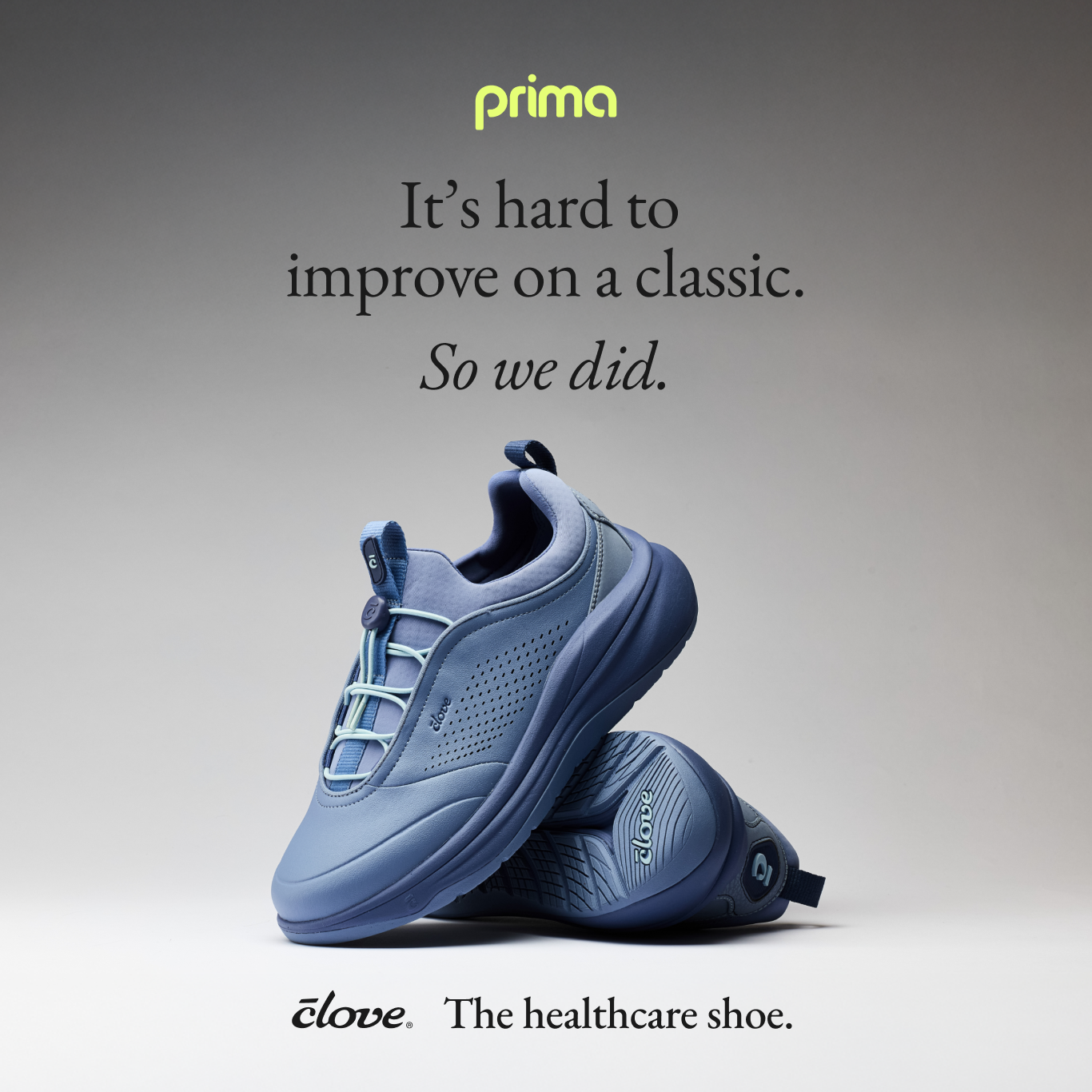
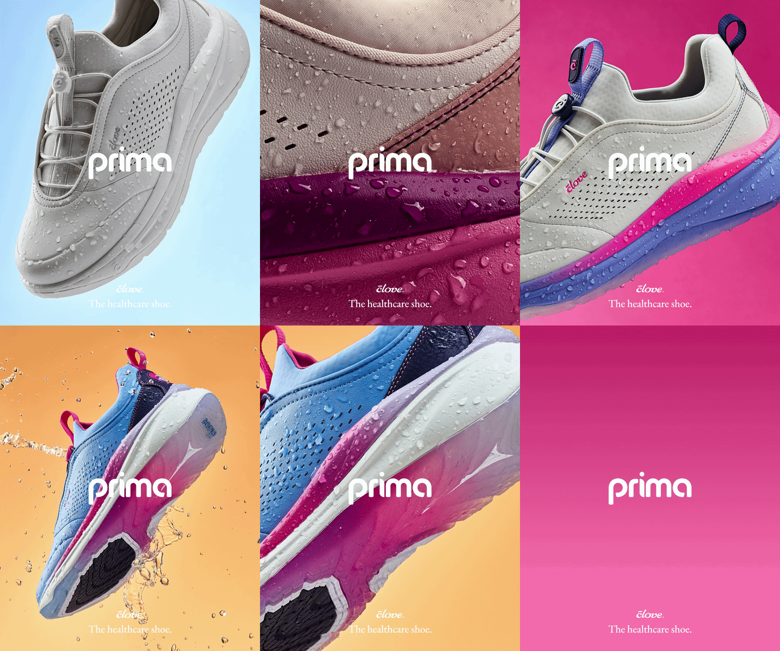
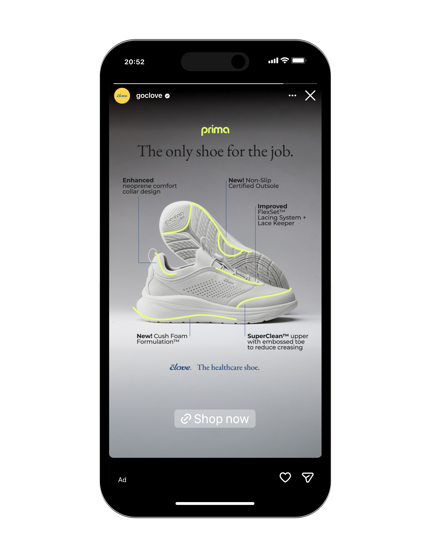
When they set out to launch Prima, an evolved version of their best-selling Classic, we partnered with their team to develop a logotype and brand direction for the shoe. The goal: build excitement, clearly communicate the new features, and make sure Prima felt unmistakably Clove — bright and confident, without feeling clinical.
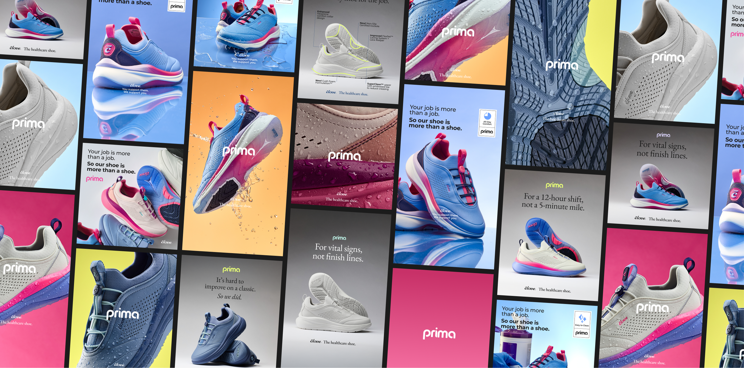
With the identity in place, we scaled it across a full ad campaign for Prima. Drawing on data from previous Clove campaigns, we explored a few distinct creative directions — Apple-inspired minimalism, retro workwear aesthetics, and builds on Clove's existing ad language.
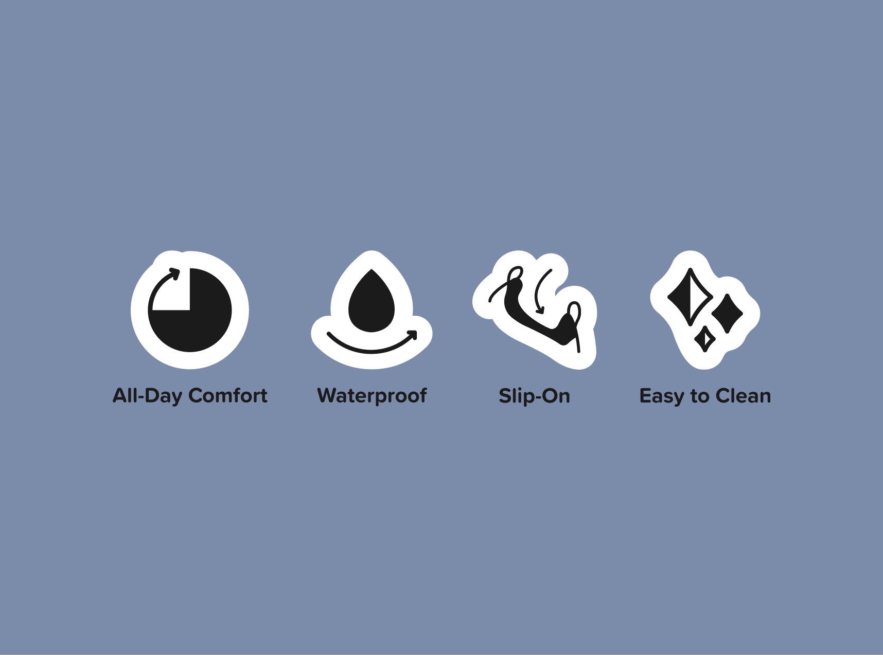
We also developed a set of USP icons to bring Clove's core features to life — fast slip-on entry, waterproofing, all-day comfort, easy cleaning. Originally created for a previous launch, the icons became a permanent part of Clove's marketing language, carrying through to Prima. They gave the brand a visual shorthand that made the value proposition faster to read and easier to remember.

Related Projects